Item Tree Browser
This is a highly functional browser for the browsing of hierarchies, lists of items, item details and associated relationships and content. It allows easy capture of items as well as relating them to others. Simultaneous
creation and linking of items is supported, as is linking to a filtered list of items. Ad-hoc filtering can be carried out on both type selection and item selection lists. For hierarchies of items, you can choose how many
levels you want to expand by default and whether you want a strict hierarchy (show only root items in the initial list) or a looser one where all items are listed but can be expanded where they have children.
A typical Item Tree screen is shown below:
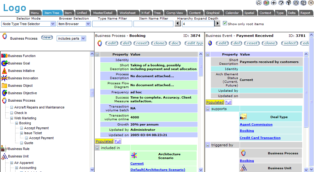
The general EVA Netmodeler navbar appears on almost all pages. See further help for the Navbar

Select Options Frame (below Navbar)
This area allows you to select options on how the browser should work. Some of these options may not be visible, dependent upon systems settings chosen by your administrator. The range of options includes:
- Selector Selection determines how you want the node and item list in the lower left pane to appear.
- Node Type Tree Selector will provide a view as shown above. This lists the node types visible to you, within
node types you click on, the list of nodes for that type, and the hierarchy of nodes within a type based upon the default hierarchical relationship (or one you select within the list pane)
- Node Type Dropdown Selector will provide a simpler (but also faster) drop down selection list for types, and a
simple item list for items. (This is similar to the selector in the Item Browser). You may want to use this method
if you know exactly where you want to go, or if you are working over slow connections and do not want to wait for tree views to load. See an example of this selection mode
- Domain Tree Page Selector will provide the domain tree selection list. This lists the domains visible to you, and
when you click on a domain, the list of domains within the selected domain (if any exist), and a list of types within the domain. See an example of this selection mode
- Browser Selection
This provides a way to switch the view (right hand two panes) from item details to alternate views. The options are:
- Item Browser - a view with two detail panes as above
- Content Browser - a view with a navigation bar for relationships and a content pane (as normal for the content browser)
- Type Name Filter
Typing a string of characters in this field allows you to filter the types shown to those that match
- Entering characters only will show types whose starting characters match the search characters
e.g. An will match types Animal, Animated Character and Anniversary, but not Business Annuity
- Entering characters preceded by the wildcard character (*) will match the provided characters anywhere in the type name
e.g. *An will match types Animal, Animated Character, Anniversary, Business Annuity and Increase Annual
- Item Name Filter
This works in a similar manner to the type name filter, but on items of the selected type. The type must be selected and the item list expanded before it is effective
- Hierarchy Expand Depth
Determines how many levels (by default) to expand the node tree. You can modify it to your preferences.
- Show only Root Items
- Setting this option on will limit the items listed in the tree view to those which do not have parents. Best for strict
hierarchies where you are going to navigate from the top of the tree downwards. Useful where you have high numbers of items of a given type.
- With the option unselected, all items will be listed for the type, and any descendants from an item may be seen
when it is expanded. Useful where you may not navigate to items via the hierarchy, or where the list of items is relatively short.

Item Tree List Pane (bottom left)
This is where the list of node types visible to you (based on permissions) and matching filter conditions (either formal filters or ad hoc filtering from the selection panel) are shown.
- Selecting the link for a type retrieves the list of items of that type matching current filter conditions.
Selecting the type name again will collapse the item list for that type
- Selecting the + next to an item expands the hierarchy.
- Selecting the - next to an expanded item will collapse it again.
- Selecting the link on an item name will display it for viewing and editing in the center pane.
Controls
New button will allow creation of a new item of the same type, with details being captured in the center pane.
Hierarchy relationship drop down selector allows choosing an alternate relationship between items of the type (if
available) to use as the hierarchy for organizing the tree. For example, we may normally use the default "includes parts"
relationship to see a decomposition of Business Units according to the organization structure, but we may choose to use another, say "located within" to see a decomposition based upon geographical location.

Item Details Pane (bottom center)
The properties of the currently selected item will appear here, followed by the relationships for the current item. You are able
to edit, delete, reset values to defaults, clone or document the item, depending upon your privileges. You can also relate the
item to other items using legal relationships defined in the meta model, delete relationships, or relate to items matching filter
criteria which you provide. See details below. All of these options will be dependent upon your privileges with respect to the type.
- You can edit this item by clicking the edit button
- You can delete the item by clicking the del button
- You can reset the default values of item properties by using the reset button. You will be presented with a list of properties and can choose which to reset. Default values are drawn from the default item of the type
- You can clone the item by clicking the clone button. This creates an item exactly like this one (in terms of properties and relationships), but with a different name that you will provide
- You can document the item by clicking the doc button. This will launch the item documenter utility, which provides a printable report of the item details and the details of all items directly associated with it
The list of relationships can be limited to only those that are populated for the current item, or the full list of legal relationships
for the item type can be displayed. A relationship is said to be populated when the current item is associated to another type in the repository using that relationship.
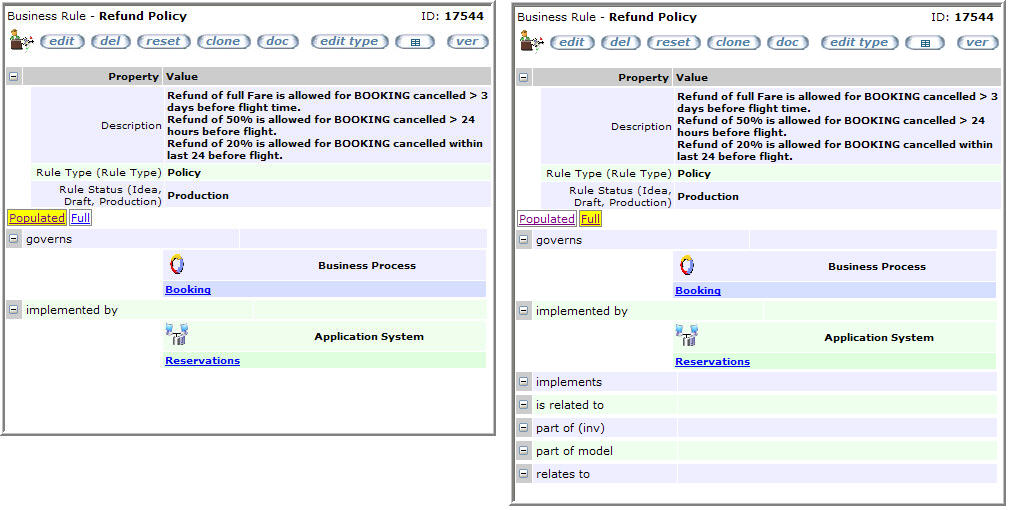

Within the list of relationships, there are "hidden" buttons which will appear when you move your cursor over them. This is
done to make the view visually simpler, to allow printing without too many buttons on the display and to save on screen space and clutter.
Below is a discussion of how relationships are displayed and maintained. Different sets of buttons are available at different levels:
Buttons at the relationship type level
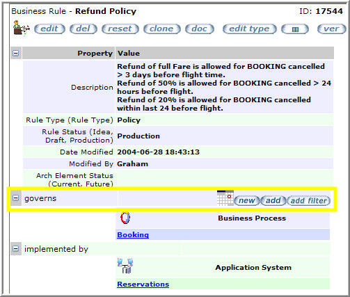
New button will create a new item of a legal type for this relationship and link it to the current item using this type of
relationship. You will be asked to select the required type if there is more than one legal type. You will provide the new item properties in the right hand pane.
Add button will present a list of items which could be (but are not yet) related to this item via this kind of relationship. You can check and link multiple items in one operation.
Add filter button will present a list of types that are legal to link in this way, check boxes to select which ones you are
interested in and entry boxes where you can type matching criteria to filter items to those where there is a match within the
name. A second list will then be presented with the items matching criteria to allow you to select and link. Multiple items can be linked in one operation.

Buttons at the relationship and target type level
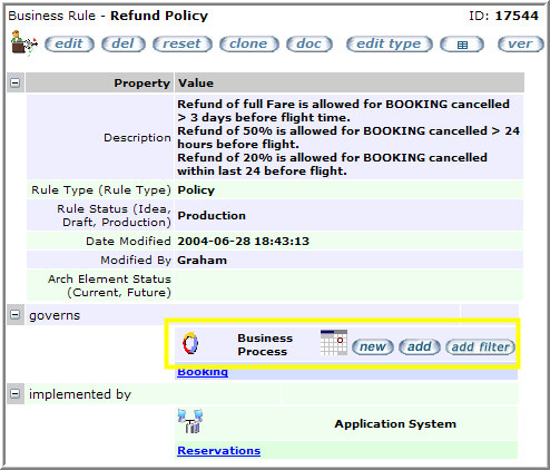
The new, add and add filter buttons here work as above, but will limit the related items to the type next to which they
appear. This shortens lists of potential items to link and saves selecting a target type where various ones can be linked via this relationship type.

Buttons at the related item level
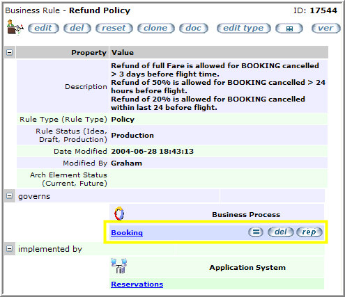
The view details (=) button will show details of the related item in the right hand pane.
The dele button will delete the relationship to the related item. It does not delete the related item itself.
The rep button will enable you to replace the existing related item with another via the same relationship type.

Creating Related Items which have Relationship Properties (Info Nodes)
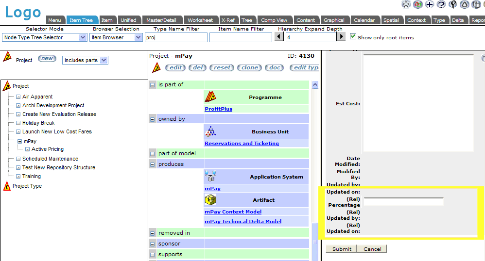
When you create a related item and there is an info node on the relationship between the current item and the new item (e.g.
We may be current on Project1, and create a Person Joe, via the relationship "employs" where the info node on the
relationship will hold the role for Joe in the project as well as his start date) then the info node details are captured at the
same time as the related item, in one operation. The properties are shown following the normal related item's properties
toward the bottom of the capture form, with the names prefixed "(Rel)". The screen capture below illustrates this:

Related Item Pane (bottom right)
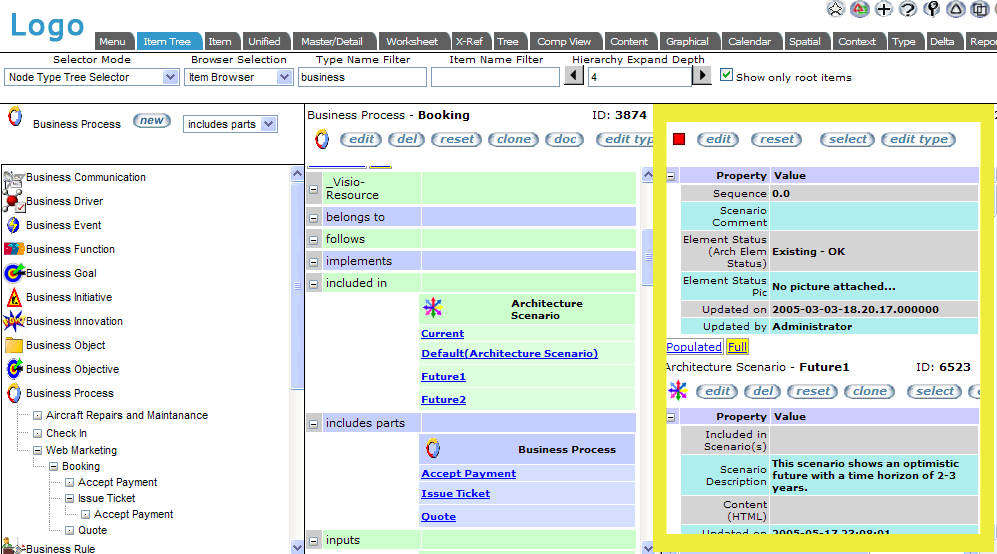
This frame displays details of a related item which was selected for viewing in the center pane. If an info node exists
between the selected item and this item, its details will be shown at the top of the pane. You are able to view, edit, delete,
reset, clone or select the node. The function of these operations should be clear from the preceding discussion, except for
select. Select will make this item the focus of the browser, i.e. it will now appear in the center pane and become the
selected item in the tree list. It is thus possible to navigate through the knowledge space by selecting related items.
Item Tree Browser with Related Item and Info Node editing in Right Hand Pane

|